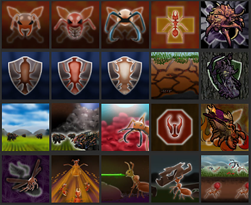
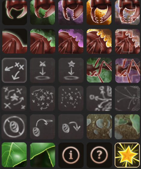
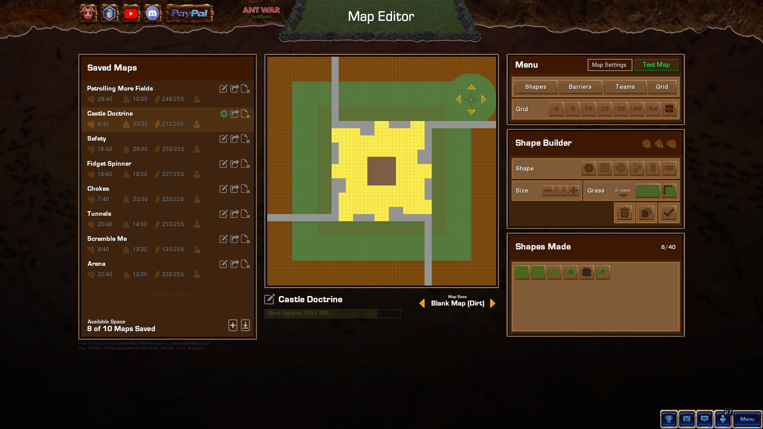
Feature Spotlight: User Interface (AW)
All the way back in February of 2018, I joined a mod team for a mod called Ant Nob. A mod of the game Ant Colonies. Itself a mod of Sim Zergling. Itself a mod of Starcraft 2.
A mod of a mod of a mod. Fun stuff. Potentially confusing to track. Check out the history of Ant War if you’re curious to learn more of the details.
Anyway, I joined the Ant Nob team as an artist. A graphic designer.
I helped the Ant Nob team primarily with 2D graphics for things like their buttons.
I would go on to start my own mod, Ant War, and as I learned to program a big complex game with many moving parts, I made sure to make it look as beautiful as possible.
Take a look at the examples below. Basically the game is about ants, so I gave everything an earthy feel. I wanted to make the player feel like their UI was quite literally in the dirt.
Starcraft 2 has players accustomed to a large UI console at the bottom of the screen, and since my players were all Starcraft 2 players, I simply kept and reskinned the console.
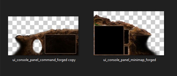
Ant War UI Console reskin. Starcraft constructs the console with a bottom left piece, bottom right piece, and then a repeating tile bar that extends as wide as necessary.
The console went through several evolutions, scaling in resolution and expanding for new buttons as needed.
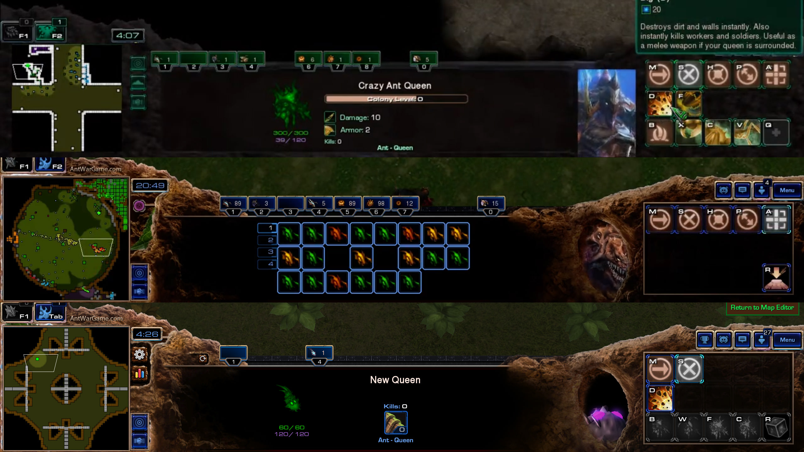
Bottom UI Console evolution over a few iterations. Top is the earliest design, bottom is the final design.
Aside from most unit button art and game icons, most UI elements are sized and positioned using XML in Starcrafts Layouts files. I heavily contributed to writing a tutorial for other developers on how to make and modify Starcraft 2’s layouts for custom UI.
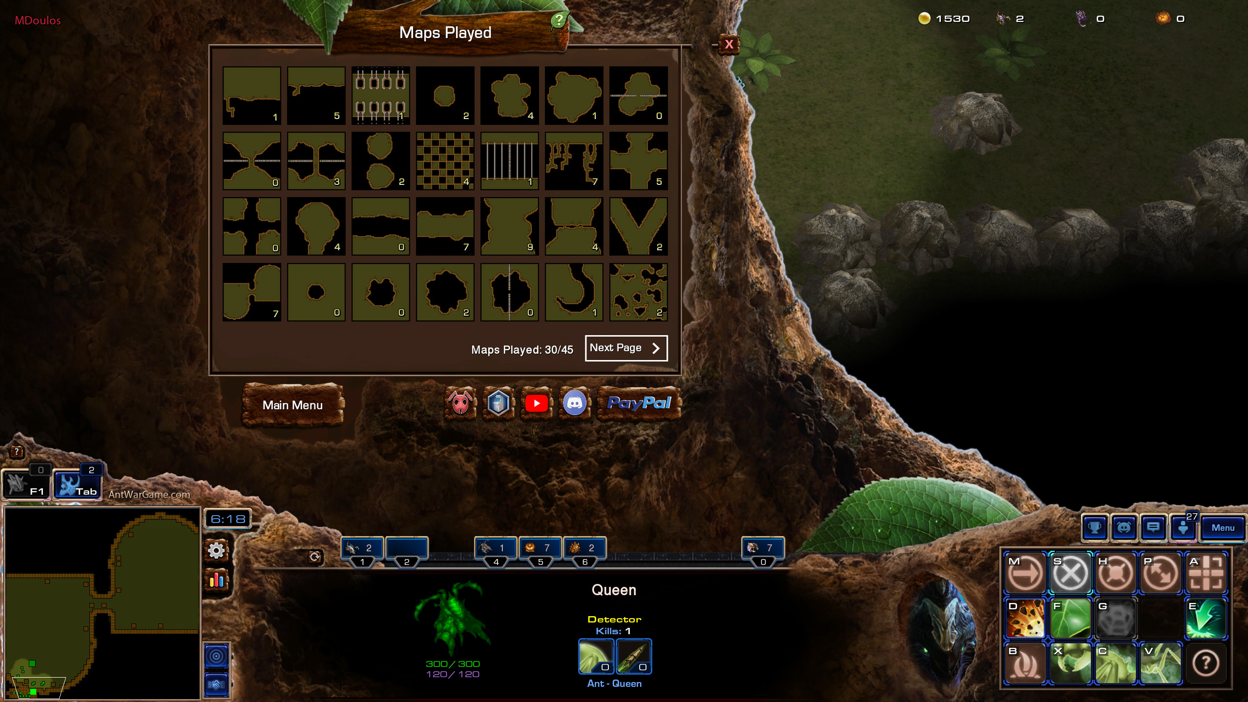
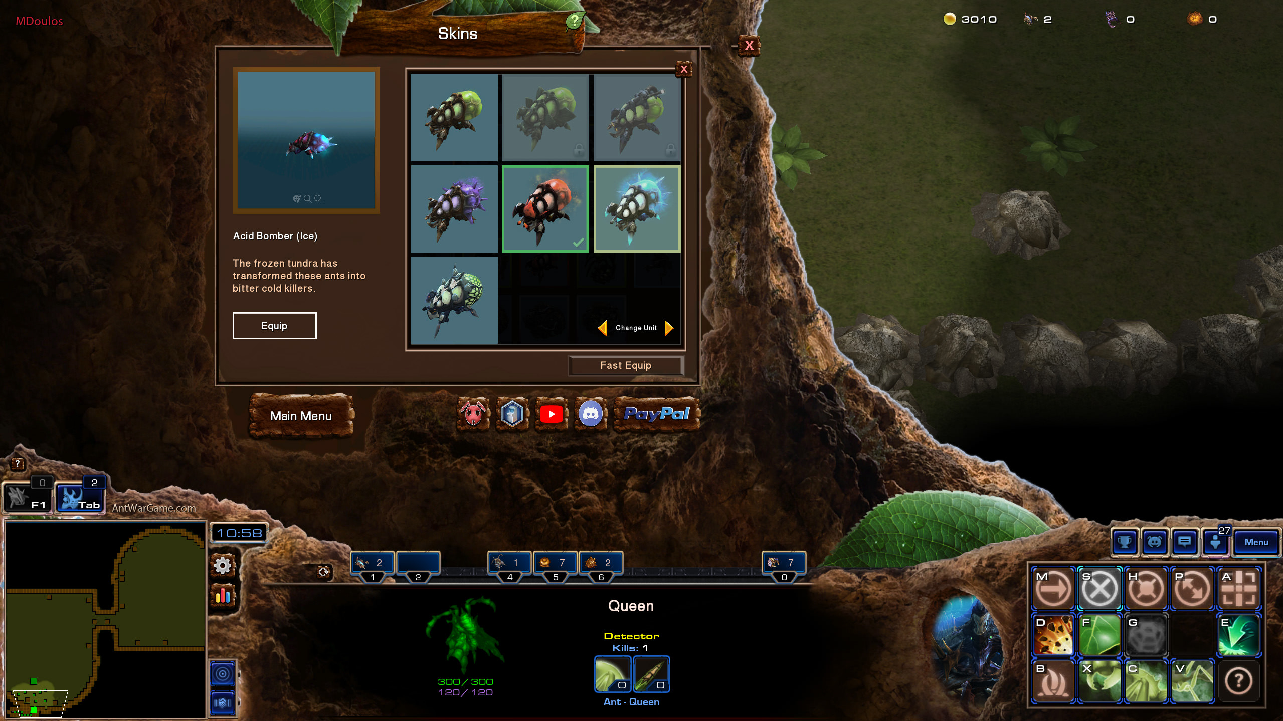
Here are other UI elements as the appear in different screens.
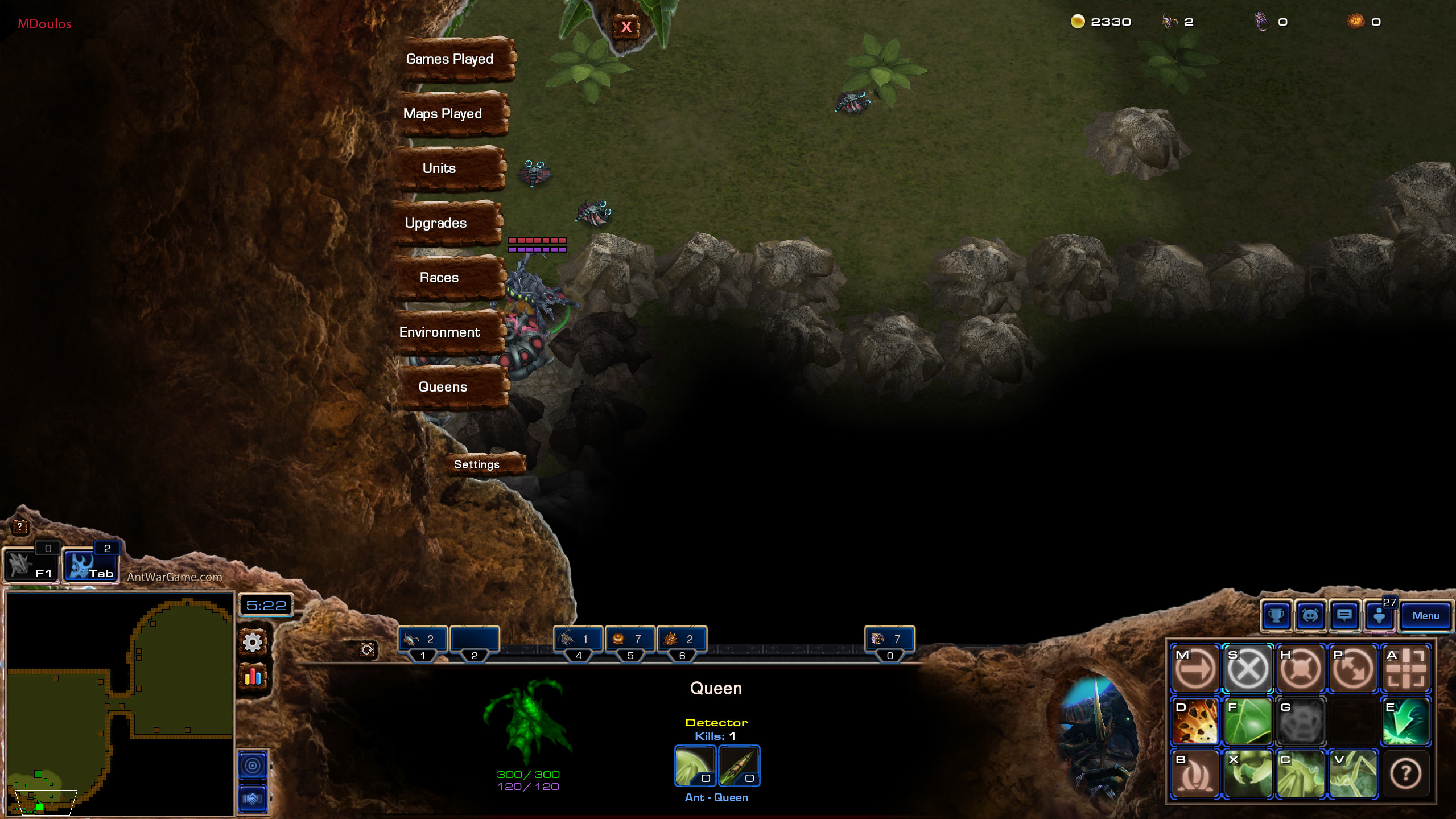
This statistics menu animates as a glide in from the left. The X button glides down from the top. It retreats in the same way.
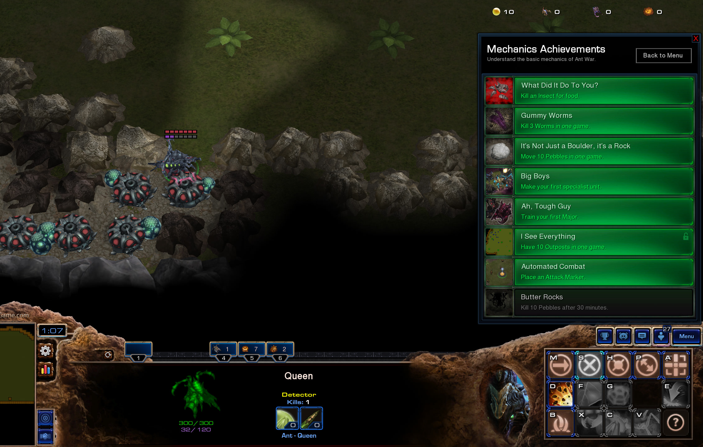
Achievement tracker. All UI above the bottom right appears in a blue frame to match the UI of the Menu and social icons that are Starcraft navigation defaults. That includes the custom discord popup accessed via the discord ant button next to the achievement trophy.
